For a list of BASHing data 2 blog posts see the index page. ![]()
MAD about the median
Political economist Blair Fix has blogged about statistical hocus-pocus brewed with "average income", "average house prices" and "average house rents". Based on those descriptive statistics, housing affordability in the USA hasn't changed much in 50 years, which is nonsense. It's nonsense because income inequality in America has grown spectacularly in that period, meaning that the proportion of income earners that can't afford to buy or rent a house has grown spectacularly, too.
The average, or mean, can be a misleading one-figure summary of a batch of numbers like "personal incomes". The simplest alternative is the median. It's a midpoint figure: half the numbers in the batch will be below the median, and half above.
To their credit, number-crunchers like the Australian Bureau of Statistics routinely offer median values. For example, in 2021-22 the personal income for 187616 earners in non-metro Tasmania (where I live) averaged AUD$57561, but the AUD$48545 median was 16% less than the mean. This difference indicates that high-income earners were pushing the mean upwards.
A median value is easy to get on the command line with GNU datamash. My demonstration batch of numbers is a list of the volumes of 1198 logs sent to Tasmanian sawmills in 1997-98 (filename "logs", header line "Volume"). The volumes range from 0.16 to 12.99 m3, and datamash gives the median and mean (below). Once again the mean has been pushed upwards:
datamash -H median 1 mean 1 < logs

The -H option tells datamash that the dataset has a header line, and the header for each column will be added to results for column operations. The "logs" file has only one column ("1") with header "Volume".
You can show a spread of values (like that of the log volumes) with a graph, but you can also do that just with numbers, for example with standard deviation. That statistic is based on the mean value, though. A popular alternative method is to use quartiles. You divide the population of numbers into the lowest 25% of values (lower quartile), the highest 25% (upper quartile) and the group between the highest and lowest (interquartile range). You then calculate the median value in each group. datamash is again your friend:
datamash -H q1 1 iqr 1 q3 1 < logs | column -t -R 1,2,3

I've passed the datamash result to column with options to present the output as a table (-t) and to right-justify the 3 table columns (-R 1,2,3).
A less well-known statistic that summarises variability is the median absolute deviation, or MAD for short. It's described as "robust" by statisticians and is less influenced by outliers. To get the MAD you first calculate the absolute difference between each value and the population's median. You then determine the median of those absolute differences.
Not surprisingly, datamash can do the calculation for you, and it offers two MAD variations. mad is "scaled" for normal distributions, while madraw is the raw MAD suitable for untested data like the "logs" file:
datamash -H median 1 madraw 1 < logs

To express this median-heavy way of looking at the "areas" dataset you could write
median 1.54 ± 0.65 (raw MAD). Compare that with the mean and sample standard deviation:
datamash -H mean 1 sstdev 1 < logs

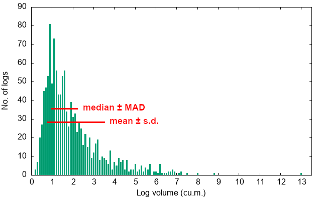
The graphic below approximates the spread limits on a bar chart with log volumes rounded to 0.1 m3. The chart was built in-terminal using mlterm and sixel graphics with gnuplot as described in a previous BASHing data 2 post. The coding details are in next week's BASHing data 2. I added the red limit lines and text to the graphic after it was built.
One way to compare spread measures is to ask What % of the numbers are within the specified limits? The interquartile range would ideally be 50% (it's 50.5% for "logs") and for normal distributions the standard deviation would be 68.27% (68.2% for "logs"). MAD lies in between those limits and for "logs" is 60.6%.
The scaling datamash can do for normal distributions increases MAD by a factor of 1.4826, lifting it to 0.96 for "logs" and increasing the spread to 69.3%. This would make MAD more like a standard deviation in giving you a picture of the spread.
For more on MAD, see this collection of statistical discussions, and for more on scaling MAD see this Stack Exchange Q & A.

Next post:
2025-01-24 Adding the missing keys and values in a key-value series
Last update: 2025-01-17
The blog posts on this website are licensed under a
Creative Commons Attribution-NonCommercial 4.0 International License