
For a full list of BASHing data blog posts see the index page. ![]()
Tidy tables for data processing
I've seen some very pretty data tables in spreadsheets, on webpages and in word-processed documents.
There were lots of colours. Careful attention had been paid to font, font size and font emphasis. Column widths, row heights and border thickness had been skillfully adjusted. In spreadsheets there were comments and metadata notes. In word-processed documents there were numbered footnotes, with superscript numbers attached to data items.
Of course, all that colour and data decoration is for human eyes. If the same tables were to be processed digitally, the processing program wouldn't care what the table looks like. It just wants the data to be tidy and workable.
In this post I explain what "tidy and workable" means for data processing.
OK for prettifying, not OK for data processing
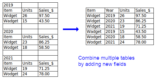
Two or more separate tables per table. If you have multiple, similar tables in a single table grid, try to combine them into a single table, otherwise put them in separate files.
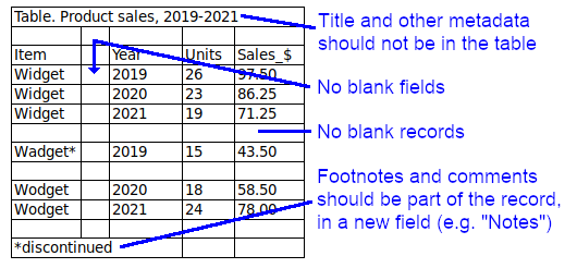
Metadata. A data table prepared for processing should not contain caption lines or explanatory information lines. People can see how that information relates to the data, but computers can't. If possible, put footnotes and comments in a new field. All other metadata belongs in a separate file accompanying the table. (Note: the header line with field names is not metadata.)
Blank fields or blank records. Spaces between fields or records might make the table easier for humans to read, but these spaces are unnecessary for processing and may cause errors.
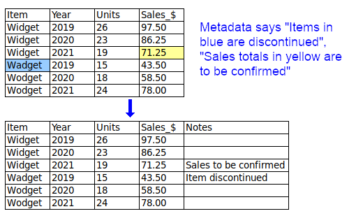
Font or colour mean something. When a table is converted to plain text for processing, any font or colour differences are lost, and with them their meaning. The "font or colour" information should instead be put in a new, separate field or fields.
Known entries are left out. Some data items may be blanked, as shown below, to "visually organise" lists. To avoid incomplete records in data processing, any missing-but-known entries should be filled in.

Tidy and workable fields
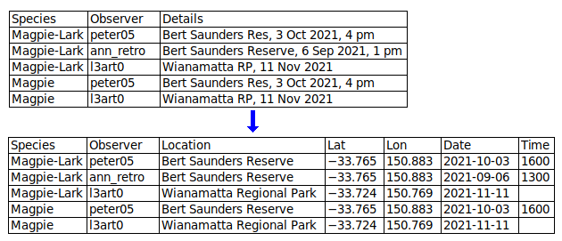
Atomise the data. The more fields you can split a data item into, the better. In a table designed for human eyes, you might keep the table narrow by packing different data items into single fields. For example, you might have a "Name" field instead of "Title", "First_name" and "Last_name" fields, to save space. When processing data as plain text, it doesn't matter how wide the table is. By splitting data items you make it easier to extract information and to check for inconsistencies and errors.
Include lots of fields to capture all relevant data. Fields sometimes get left out of pretty data tables, because they're not really important for the table's message or because including them would make the table too wide. Again, when processing data it doesn't matter how wide the table is. In each record, enter as much information as you have, in appropriately separated fields.
Each field should contain one and only one kind of information. This principle overlaps with the first two, above. In a "SoldTo" field, a data item with "Fred Bloggs, 26 March 2021" has a mix of name information and date information.
Avoid abbreviations in field entries. Abbreviations can be incomprehensible or ambiguous. There's always enough room in a digital data table to expand abbreviations.
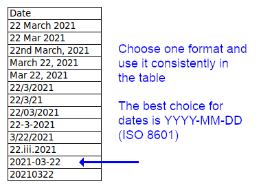
Field entries should be correctly and consistently formatted. The entries in a "Distance_in_km" field don't need "km" after each number, and "Unit_price_in_$" entries don't need a dollar symbol. All entries in an "Elevation_in_metres" field should have the same number formatting, not a mix of "1000", "1,000" and "1 000". All entries in a date field should have the same date formatting, not a mix of "May 26, 2021", "5/26/21" and 2021-05-26" (and YYYY-MM-DD is best).
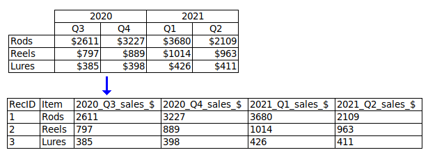
Field names should be put in a single line (the header). For example, don't have "Prices" on one line and "Wholesale" and "Retail" on the next; put "Price_wholesale" and "Price_retail" in the header line.
Field names should explain their content. "Date", "Price" and "Area" are understandable but incomplete. Date of what? (e.g. "Date_purchased"). What kind of price? (e.g. "Price_retail"). What units for area? (e.g. "Area_ha"). Avoid ambiguity: does "GuestNo" mean total number of guests, or a code number for individual guests?
Field names should be properly formatted. Don't use spaces or punctuation (apostrophes, quotes, question marks, commas etc) in field names. Good replacements for spaces are underscores, hyphens and merges, e.g. "First_name", "First-name" and "FirstName". Avoid abbreviations if possible; "AbsTemp_K" is better than "AT_K", and "AbsoluteTemperature_K" is better still. In serially numbered fields, put the number last, e.g. "address1" and "address2", not "1st_address" and "2nd_address".
Include a unique ID field with a unique code for each record. This makes it much easier to refer to particular records. The unique ID can be as simple as a serial number: 1,2,3...
Tidy and workable records
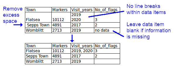
Leave data items blank if information is missing. This is a sometimes controversial recommendation. Many data compilers don't like to see blanks and prefer "na", "N/A", "no data" etc, and some processing programs complain when they see blanks. However, blanks for missing data are probably the best general-purpose option (see Table 1 in this 2013 paper). Blanks can later be filled with strings (such as "N/A") that might be required by a particular processing program.
Avoid line breaks within data items. These may break records across several lines during processing. Separate lines can be joined with punctuation within the data item, or the data item can be split into multiple records.
Trim away leading, trailing and excess spaces within data items. These are not only unnecessary, they can cause processing errors by programs that see "New York", " New York", "New York " and "New York" as different.
For help and encouragement with this post I thank Bernie Hane, Research Assistant, Department of Genetics, University of Alabama at Birmingham (USA).
Recommended further reading:
Data organization in spreadsheets
Data organization in spreadsheets for natural history collection data
Nine simple ways to make it easier to (re)use your data
Good practices for sharing analysis-ready data in mammalogy and biodiversity research
Last update: 2022-01-12
The blog posts on this website are licensed under a
Creative Commons Attribution-NonCommercial 4.0 International License