
For a full list of BASHing data blog posts, see the index page. ![]()
Mapping with gnuplot
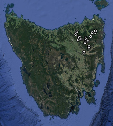
I live in Tasmania, Australia and study the native Tasmanian millipede species. I record their locations and make these publicly available on the Millipedes of Australia website. From there you can download KML files or TSV tables of species occurrence records. With these you can map the species locations in GIS or in a spatial browser like Google Earth.
Update. The Millipedes of Australia website is no longer online. It was archived in Zenodo as described here.
The GIS I use (QGIS) and Google Earth are both large, complex GUI applications. Because I manage my millipede data in a terminal, I often wonder whether I could do simple species mapping from the command line, as well. Sometimes all I need is a map plotter that puts colored markers with reasonable accuracy on a simple basemap. Five years ago I wrote in an online magazine about using quickplot for this purpose. This week I wondered how far I could get with the venerable gnuplot, a command-line plotter that's probably older (32 years) than some of the people reading this post.
Pretty far with gnuplot, as it turns out!
Getting the points. gnuplot can draw a map polygon if you give it a set of points which represent the corners of the polygon. To get the points for a polygon map of Tasmania I started with a coastline shapefile of the main island of Tasmania and its satellite islands, in the WGS84 coordinate reference system. You can download shapefiles of that kind from the Australian Government's data repository here.
I opened the shapefile in QGIS. For a reason I'll explain in a moment, I made the main island of Tasmania and the 12 largest satellite islands into 13 separate shapefiles, by selecting each in turn and saving them as new layers. Highlighting each layer, I then used the excellent "MMQGIS" plug-in to generate a CSV of the corner points with MMQGIS's "Export Geometry to CSV" function. This function builds separate CSVs for the "nodes" (= corner points, vertices) of the shape and for the attributes of the shape. I discarded the latter file, which I didn't need.
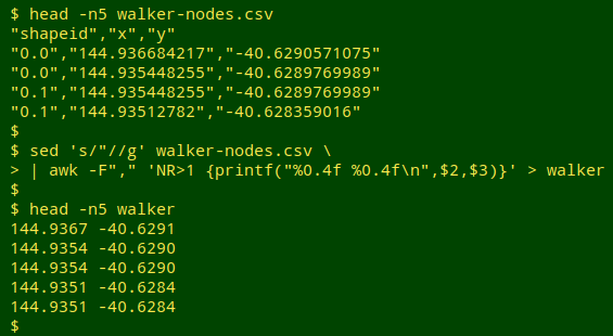
The screenshot below shows the first 5 lines of the CSV for Walker Island. I used sed and AWK to remove the double quotes and the first line, and to print just the longitude and latitude of each corner point rounded to 4 decimal places, with a space in between. That made a simple data file for gnuplot: 2 space-separated columns of data.
Removing internal lines. Unfortunately not all the 13 point files were ready for gnuplot, as shown below for a plot of King Island. (I explain how to build a plot below.)
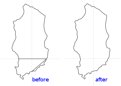
gnuplot correctly joined up the boundary points, but it also connected points across the inside of the polygon ("before" plot). That wasn't a gnuplot error. It happened because the polygon shapefile for King Island was actually in 3 parts, which MMQGIS combined when generating the points CSV. Here are the first few lines of the King Island file:
143.8902 -40.0001
143.8878 -39.9926
143.8878 -39.9926
143.8860 -39.9809
143.8860 -39.9809
143.8838 -39.9742
143.8838 -39.9742
143.8793 -39.9671
143.8793 -39.9671
143.8779 -39.9664
gnuplot draws a polygon by drawing lines between successive points in the data file. The first line it draws in this case is between 143.8902 -40.0001 and 143.8878 -39.9926. The next line is between 143.8878 -39.9926 and 143.8878 -39.9926, and so on. But buried in the list of points is this sequence, which is the end of one of the 3 parts of the shapefile and the beginning of the next:
144.1313 -39.9823
144.1278 -39.9933
144.1278 -39.9933
144.1229 -40.0001 # Huh?
144.0000 -40.0963
143.9919 -40.0980
143.9919 -40.0980
143.9874 -40.0996
To prevent gnuplot from reading the sequence as a continuous one, I added 2 blank lines at the transition. gnuplot would then finish joining up the first set of points before continuing with the next set.
144.1313 -39.9823
144.1278 -39.9933
144.1278 -39.9933
144.1229 -40.0001
144.0000 -40.0963
143.9919 -40.0980
143.9919 -40.0980
143.9874 -40.0996
Double-spacing the other transition in the King Island file and re-plotting, the internal lines disappeared (see "after" plot, above). Finding those transitions in the "multi-part polygon" lists was easy: they're the places within a list of points where a point wasn't repeated on the next line (see lists above). Using a text editor, I added double-spacing at those transitions in each of the 3 multi-part polygon lists. I then catted the 13 points lists into one, separating them with a double space. The resulting points list with its 13 polygons was called "tas".
Proportions. The draft configuration file for gnuplot, called "mapper", was in the same directory as the data file "tas" and looked like this:
set term wxt size 700,550 enhanced font "Sans,10" persist
set border lw 1
set style line 1 lc rgb "black" lw 1
set format x "%0.1f"
set format y "%0.1f"
set xrange [143.5:149.0]
set xtics 0.5
set ytics 0.5
set grid
unset key
plot "tas" with lines linestyle 1
The first line tells gnuplot to put its output plot on my display (set term wxt) and keep it there (persist) after the plotting command has finished and I return to a prompt. The plot will have an overall size of 700 by 500 pixels (size 700,550) and any text displayed will be size 10 Sans (enhanced font "Sans,10"). The plot will have a 1-pixel-wide border (set border lw 1). The lines joining points will be in "style 1" (set style line 1) and will be black (lc rgb "black") and 1 pixel wide (lw 1). At this stage I don't need a plot legend (unset key).
The plot axes will display latitudes and longitudes to the nearest tenth of a degree (set format x "%0.1f", set format y "%0.1f") with tick marks at 0.5 degree spacing (set xtics 0.5, set ytics 0.5), and the x axis (longitude) will range from 143.5° to 149.0° (set xrange [143.5:149.0]), to neatly enclose Tasmania. Finally, the plot will have a grid to make the latitude and longitude more obvious (set grid).
The last line of the gnuplot configuration file is the instruction to plot the points in the "tas" file, and to join the points with lines following the line style specified earlier. I entered the command "gnuplot mapper" in a terminal and this window popped up:
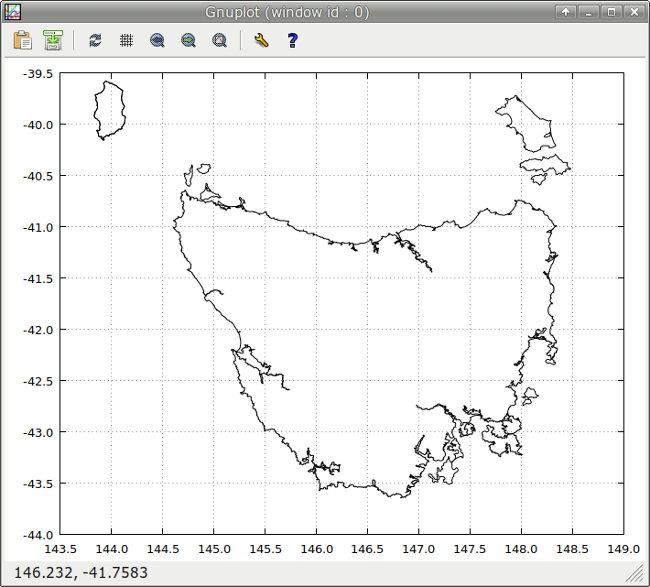
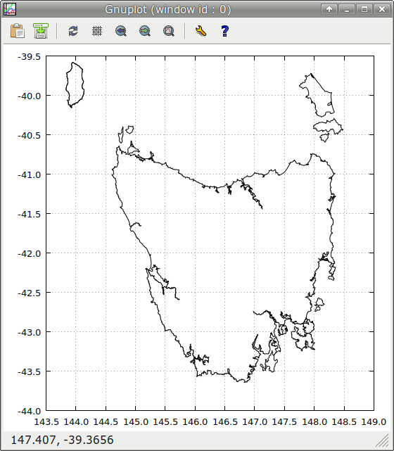
Hmmm... That geographic projection wasn't as pretty as a Mercator one would be. But without doing complicated projection calculations, I could approximate a Mercator projection by adjusting the overall plot size, making the longitude scale proportionally longer than the latitude one. I made the adjustment by trial and error using a genuine Mercator projection of Tasmania as a model. The size option in "mapper" was changed from "700,550" to "550,550", and the result was quite satisfying:
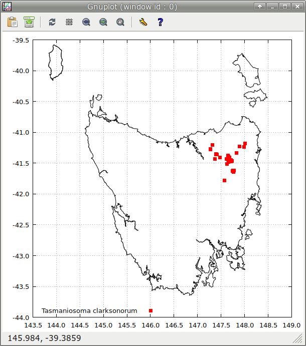
A species plot. The millipede species Tasmaniosoma clarksonorum only lives in northeast Tasmania. I made up a longitude[space]latitude list of its known occurrences and saved it as the file "tascla". I then modified the configuration file "mapper" as shown:
set term wxt size 550,550 enhanced font "Sans,10" persist
set border lw 1
set style line 1 lc rgb "black" lw 1
set format x "%0.1f"
set format y "%0.1f"
set xrange [143.5:149.0]
set xtics 0.5
set ytics 0.5
set grid
set key left bottom
plot "tascla" with points pt 5 lc "red" ps 1 title "Tasmaniosoma clarksonorum"
replot "tas" with lines linestyle 1 notitle
The first change was to add a legend (set key) at the bottom left of the plot (left bottom). Next, the "tascla" file is plotted (plot "tascla") as points (with points) in the form of squares (pt 5, a built-in style) of small size (ps 1) and coloured red (lc "red"). This plot is labelled in the legend with title "Tasmaniosoma clarksonorum". Finally, after "tascla" is plotted, the basemap is added with the "replot" command, but without a label in the legend (notitle). The result looks OK:
And next? Well, it works, so I could write a script that offers a list of species, then takes the selected species, gathers up its records, pulls out the longitude/latitude of each occurrence as a space-separated list, saves that list as a file, then generates a gnuplot configuration file to plot that file, and launches gnuplot.
Actually, I already wrote a script like that, years ago, to make a single-species KML file with museum registration number and spatial uncertainty attached to each marker.
I think gnuplot could be a wee bit under-powered for species mapping in 2018...
Last update: 2021-12-24
The blog posts on this website are licensed under a
Creative Commons Attribution-NonCommercial 4.0 International License